The following are a few tips to help make any content you author in Canvas easier to read and accessible to students with disabilities.
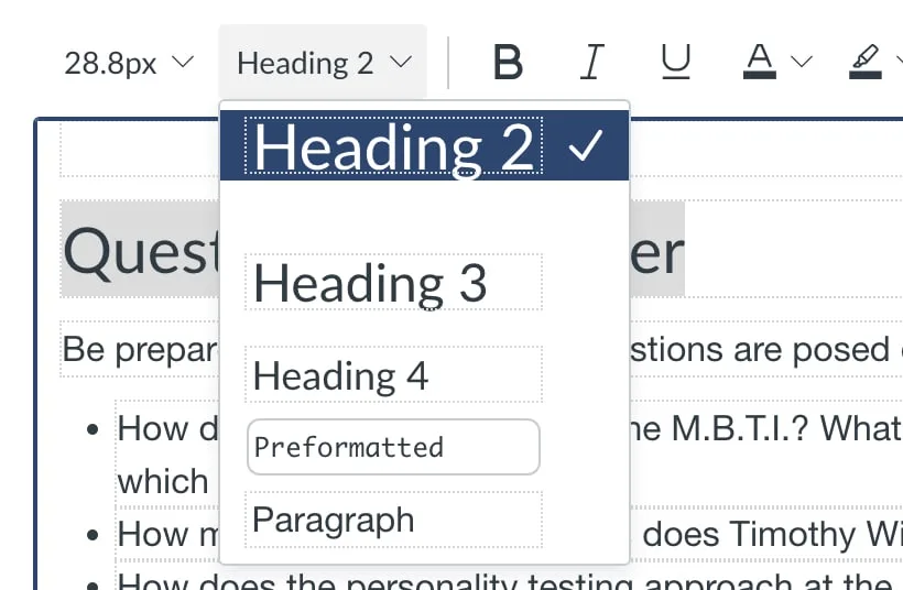
1. Use headings to structure pages

For both clarity and accessibility reasons, we recommend using headers to organize your pages.
Headings help make pages easier to digest at a glance, giving students a clear sense of how the content on a page is structured.
For students using screen readers, headers facilitate easy navigation of different sections of a page. Read more about why headings help with accessibility
You can change the size of headings using the font size menu item to the right of the headings drop-down.
2. Make sure links have meaningful text
When adding links, make sure the link has text and is not just the raw URL or a generic text like “Click Here”:
NO: https://www.16personalities.com/free-personality-test
NO: Click Here
YES: Briggs-Meyers Typology Test
This not only makes links more concise, easier to read and informative, but also makes the links more accessible for screen readers
3. Add alt text to images for accessibility
Adding alt text to images makes visual content accessible to those using a screen reader. Alt text is an additional field included when you add an image.
For details about alt text, see: How do I manage alt text and display options for images embedded in the Rich Content Editor as an instructor?
